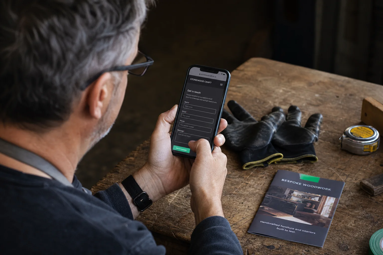
The website blocks people on phones
On a phone, your website demands too many fingers and too much patience.
A rushed customer will not zoom three times, close a window and hunt for your number in the footer.
Test with one hand: read the offer, call and send an enquiry. No step should require zooming, precision or backtracking. Fix the first observed failure before anything else.
Run the one-hand testObservable signs
Three actions reveal a poor mobile journey
Three signs you can check without a specialist tool.- 01
You must zoom to read or tap a link.
- 02
The phone number or main action is outside thumb reach.
- 03
The keyboard hides fields or the form needs too much typing.
What this means
Mobile is not a smaller desktop
Space, thumb and context change the experience. A customer may search outside, on site or between appointments.
A local issue may not need a redesign. Structural overflow, delays or layered windows deserve a broader audit.
Useful order
Run the one-hand test
Run these checks in order before buying anything.- 01
Open the key page
Use a real phone, not only a narrow desktop window.
- 02
Call or write
Find the action and complete the form without rotating.
- 03
Record the first failure
The first zoom, wrong tap or stop becomes the priority.
Next step
Fix the journey before redesigning the surface
The website method shows what to change. Pricing explains scope. The assessment helps choose between an adjustment and redesign.FAQ
Test a website on mobile
Should I test several phones?
Yes, at least one compact screen and one common device.
Is a fixed action always useful?
Only when the main action is clear and it does not cover content.